The Making of You, Me and Coffee
This post contains spoilers for both Home (5min) and You, Me and Coffee (10-30min) - I would recommend playing them before reading.
Back in 2019, I dove into Bitsy for the first time. I made a game called Home, then attended a workshop (led by the amazing Shimmerwitch), which made me feel pretty ambitious. I left the workshop with an idea embedded in my mind – to make a branching visual novel with Bitsy.
I knew Bitsy wouldn't be the ideal tool for a visual novel, but there was something about its gameboy-like art which sparked the idea, visually fully-formed. After the workshop, I used Pixsy to create the screens below. This is it, I thought, this is the game I want to make! ...As soon as I figure out branching, unlocking and all of that.
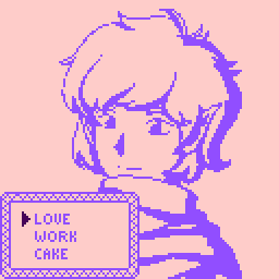
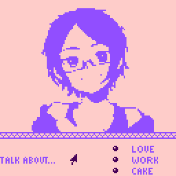
Early mockups of what would become You, Me and Coffee
Strengths and Weaknesses
When I made Home, I played to Bitsy's strengths to tell the story I wanted to tell. Each screen represented a physical space, one I was comfortable decorating with a Pokémon-like aesthetic. I wanted to tell the story of a family across generations, a tiny version of Allende or García Marquez. I made each screen transition shift you ten years into the future, rather than ten metres to the right, and changed the background colour to hint at time passing.
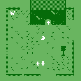
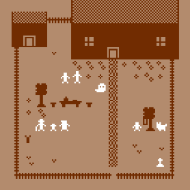
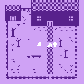
Home, from beginning to (an) end
You, Me and Coffee did not snugly fit within Bitsy, a fact which didn't surprise me. It's not unusual for me to make a first game within an engine's comfort zone, then a second one pushing its boundaries... but this one really would not fit. I liked having three simple dialogue options, but that made me want to give players five choice points per branch. Five! The game was huge, even as a Twine prototype, so implementing it in Bitsy would be a nightmare. I could picture this game so clearly, but not how to create it.
The Twine project (codename: Bitsy Talk) sat on my computer for a few years. My thoughts kept returning to it, full of longing for this cute conversation game that was clearly out of scope. Every time I tried to trim it I felt unsatisfied – going down to four choice points per run would reduce my work significantly, but I wasn't really fixing the underlying problem.
Down to Six
Finally, near the beginning of this year (2022), I found my solution – each of the three conversation topics would disappear after you used them. Sure, I would miss some funny outcomes (ME, ME, ME, ME, ME...), but I would have interesting content for every branch – 3P3 means only six options! Plus, if the options visually disappeared, players would understand they couldn't repeat them.
Six seemed like a very small number of branches, especially if I limited the amount of text for each option, to better suit Bitsy (and embrace being more economical with my words). In the end, I added two features which helped You, Me and Coffee feel like a complete game. First, each branch would have a unique extra choice which flowed naturally from the conversation. If you had been talking about reading habits, you might ask your friend about BOOKS, or if you were reminiscing about a night at the PUB, you would talk about what happened that day. This should also help players notice each branch was unique, and make sure the endings didn't feel too abrupt.

A much, much simpler Twine. I don't even want to show you the old Twine
Second, I added a final branch, unlocked after seeing all the rest. This would tie up the narrative, giving players a little more insight into the character's relationship with their friend. Instead of YOU, ME or COFFEE, the only option becomes SORRY, as the playable character realises their friend experienced events very differently than their own recollection. This ending sequence also references all six endings, with gameboy-style KEY WORDS appearing in all caps for emphasis (BLUE used POKé BALL!).
Now that all my ideas were in the right place, I had to go through the steps to make the game itself.
- Writing the first draft. I did this via Twine, making a skeleton that focused on form rather than emotion. This made it clear the story I wanted to tell – differing people's visions of the past clashing – worked within the constraints I had set.
- Making character art. The two mockups at the beginning of this post were based on an illustration for an abandoned project, and a picrew I had in my downloads folder. They weren't bad as adaptations, but I wanted to create a simple, two-tone pixel character that was easy to read. Since I don't do much pixel art myself, I had a look at various tutorials and references (this Picrew in particular was very inspiring), until I ended up with a character I liked.
- Making a skeleton Bitsy with functional branching and a final ending. This was a little stressful, as someone who isn't super comfortable using Bitsy out of bounds, but thanks to various tutorials (this devlog, this set of video tutorials, and a few more I forgot to bookmark), I managed to make it work. My solution went something like this: each time the player reaches a new ending, their cursor 'picks up' an invisible item and increases a named variable (PUB, if you're doing the pub branch), as well as increasing the variable ENDS by one. Then the player steps on a door and the game pseudo-restarts, taking players to one choice screen (YOU, ME, COFFEE) if ENDS is under 6, or to another screen (SORRY) if ENDS is 6.
- Writing subsequent drafts. Thanks to Destina (the other half of Tea-Powered Games, and also my other half ♥ ) for helping me steer this in the right direction! Since I now knew I'd be able to make the game in Bitsy, I could finally focus on the words themselves, bringing more emotion (and Brighton know-how) to the piece while keeping it concise.
- Creating the Bitsy project itself. I implemented the art, including visual flourishes. I used rain to set the mood and add motion, using the rain stopping as a shortcut for how soon your friend left. I gave the friend a few simple expressions as well, as each room could easily host a different expression. I copied in the edited text, tested and debugged... And the game was ready to go!
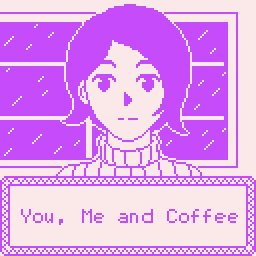
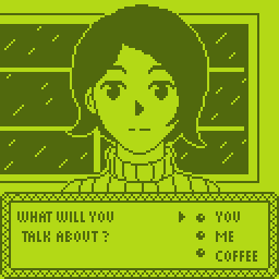
The title screen, and a little homage to the gameboy colour palette!
I'm quite happy with the result. I made the game I pictured in my head years ago, but a more interesting version – its story refined by the game's limitations (always a great feeling, as a narrative designer). The Spring Thing festival's deadline helped keep me focused, so I wouldn't spend too long tweaking expressions or moving raindrops around, and extended the game's reach beyond my Itch followers. I won't talk too much about You, Me and Coffee's reception here (especially since Spring Thing only just finished), but I am quite happy with its ribbons: Best Two-Hander, Most Sentimental and Cutest Art.
Finally, thank you for reading through this post. I know it's long, but I wanted to leave a record of my process (mechanical and emotional) in creating You, Me and Coffee. I hope it's interesting and/or informative for someone out there. And thank you to those who played the game! There are so many amazing Bitsy games out there, and I'm happy to add a small entry to its collection.
-Flo
You, Me and Coffee
Rediscover an old relationship.
| Status | Released |
| Author | FMinuzzi |
| Genre | Visual Novel, Interactive Fiction |
| Tags | Bitsy, conversation, Multiple Endings, Narrative, Pixel Art, Slice Of Life |
Leave a comment
Log in with itch.io to leave a comment.